


Like What You See?
Meet the grads behind these projects In Real Life at the grad show on April 10 & 11 at Free Space!
View DetailsAs childhood has changed, children’s health is changing along with it for the worst. More people need to be aware of why childhood obesity is a problem and how it can further impact children’s health in the future, which was achieved by creating a printed pamphlet and tablet publication.
InvisionApp
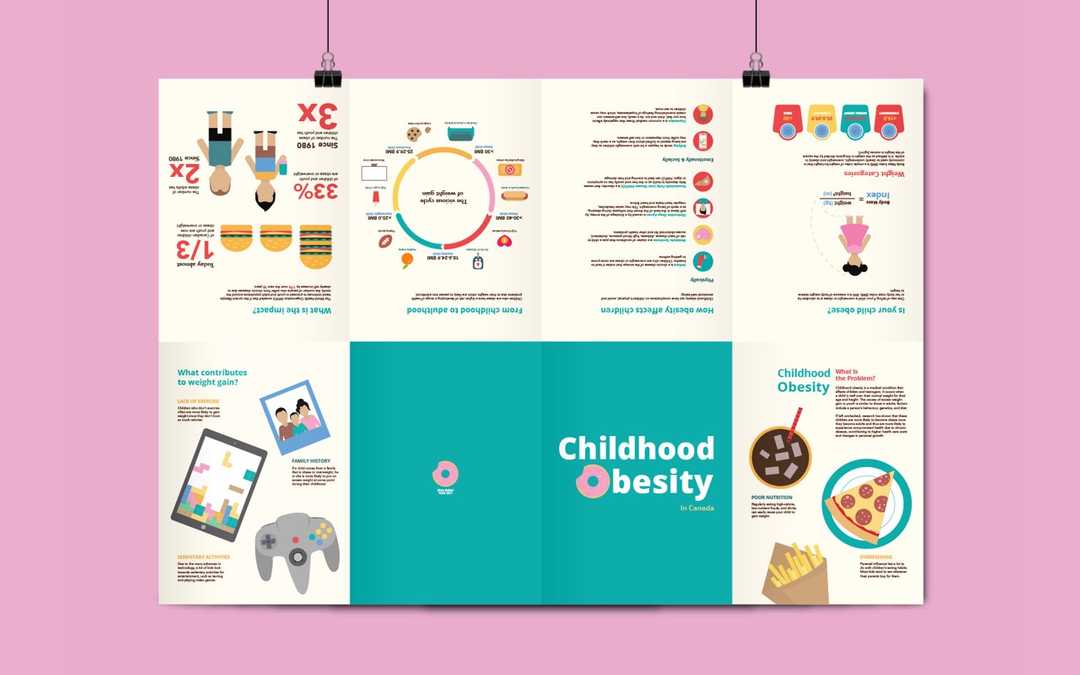
When envisioning the colour scheme and feel of childhood obesity, teal and cream were used as neutral colours. In contrast, the colours red and yellow were used to signify the dangers and risks of childhood obesity, thus highlighting important information throughout the pamphlet. I also wanted to use a bright colour scheme which would relate to childhood.
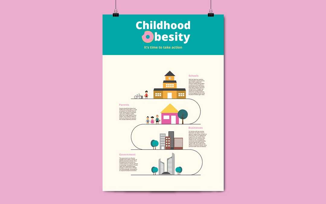
When advocating to parents, I chose to create a printed pamphlet to convey the information. Although, the poster on the back is targeted towards a wider audience. Overall, my design solution brings awareness to childhood obesity by providing parents with the essential information needed to make a change in children’s health achieved through a clean, simple, and organized design layout.
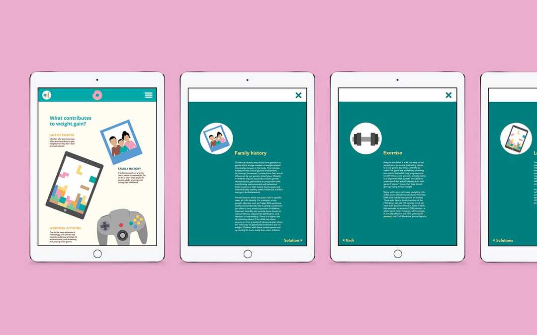
Due to the limitation of print, I did not want to overwhelm my audience with too much information. However, with the tablet publication users are able to gain a deeper understanding of childhood obesity, without feeling overwhelmed. This was achieved through the use of pop-ups and additional interactions with important information.